Prismacolor Practice/ Compositional Sketches
|
|
|
|
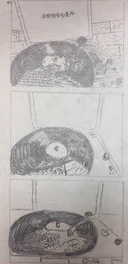
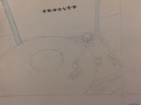
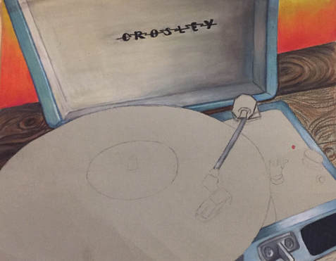
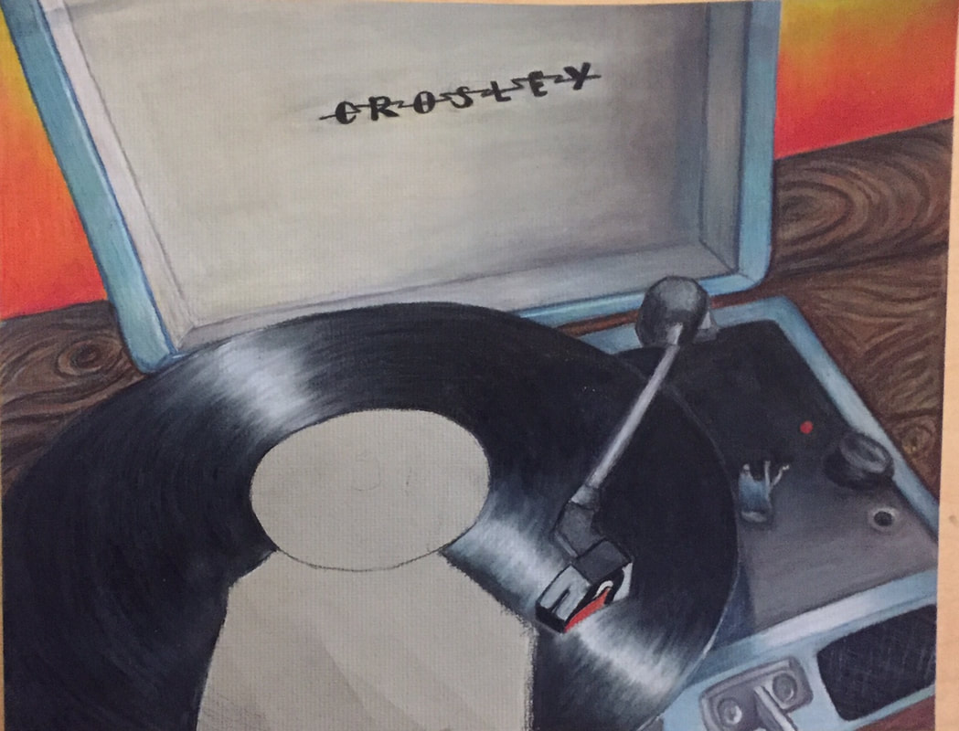
Reflective Reflection - in progress
|
|
|
|
The practice/ in progress process of this project was very important to me. It has been a while since I've used prismas, so I had to get used to using them again. The compositional sketches are terrible, but I mean when are they actually good. I love looking back at my progress pictures, and see how the piece all comes together in the end. I am glad I ended up blending out the edges of the reflection in the last picture to make it look more realistic and not have such harsh lines.
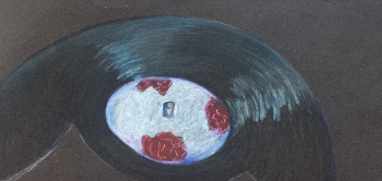
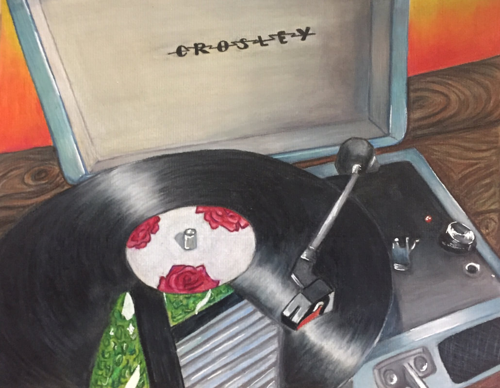
Reflective Reflection Final- "Record Breaking"
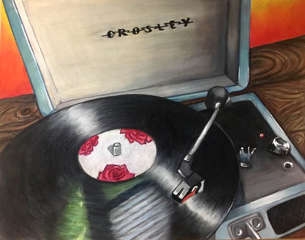
This project allowed me to learn a lot more about Prismacolor than previously. I was able to layer successfully rather than going too dark too quick, and I also used intentional lines in the record and wood to create good texture and detail. I also observed the importance of shadow to create depth in the record player case as well as underneath the record and around it on the wood. Some of the obstacles I faced was creating a nice blending, which I overcame using a blending stub and pencil, being nervous about doing new textures (wood), which I had to overcome with my own confidence, and much more. I gained more understanding of prismacolor not only from my own experience of the process, but from others around me. One of the biggest things that I discovered from this piece is how much a white gel pen can make the highlights pop way more than with just a white prisma. This project has made me look at different compositions of things, and to choose a composition that is not only interesting, but unique and has a good use of negative space with an interesting background. After this study of reflection, I have the confidence to add reflections in future projects to make them more realistic/ visually appealing and stand out. The only thing I would have done differently would be to add a slight amount of highlight to the wood, which I tried but it was too waxy and smooth to really transfer. I would have also liked to have a little bit of a hot pink with the gradient in the wall.
Oil painting- practice
|
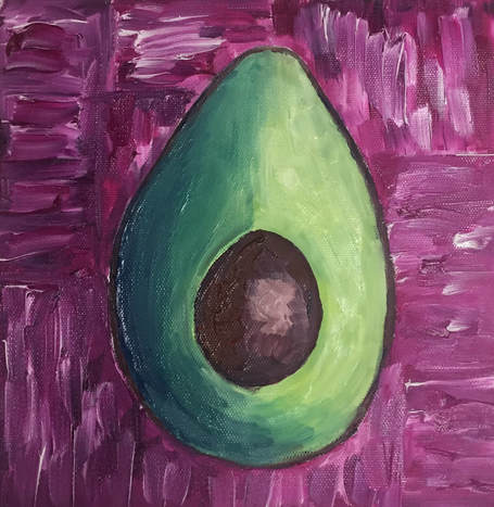
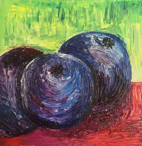
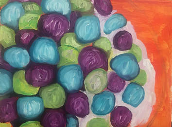
These practices were actually really fun!!! I had never used a palette knife before and I thought it was really cool and different. The avocado was also fun because I improved my blending skills and making shapes more dimensional. This was a sort of non-stressful art that I enjoyed. The canvas paper is so cute and I just wanna paint a billion lil things on it!!! I think the most difficult thing for me was getting the highlights and shadows in the blueberries, and not over blending and turning everything brown. Overall this was a good experience for me to discover creating texture and applying different elements of art with a relatively new media.
|
|
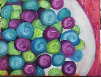
Everyday object Oil painting- in progress
|
|
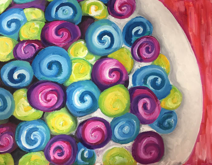
Everyday object Oil Painting Final- "Balanced Breakfast"
|
This piece was very frustrating for me, to say the least. The idea of doing a bowl of cereal was pretty interesting and unique, and I translated the idea of cereal into being bright and colorful like Trix (even though it's not a personal favorite breakfast choice). I am not super experienced with oil paint, and I had trouble executing the vision I had for this piece. I wanted it to be a more abstract piece, and focus on color and shapes and I think that turned out alright. The color choices were very intentional; initially I was gonna do a rainbow color scheme for the cereal but I decided to stick to 3 colors and a pinkish/ orange background. I like how the background looks, and it has good contrast with the bowl and cereal. I struggled getting the right texture in the cereal, so as I was working I decided to put in the swirls, which I ended up really liking. It made it more interesting and bubbly and that was what I was going for. I kind of gave up in the end because I felt like I was never going to finish and it would never be good enough and I could just go on forever trying to fix it. Normally I wouldn't do that, but I needed to move on and start on my next project and focus on things I want to put in my portfolio. It's definitely not one of my best pieces but it helped me get a better feel for painting with oils.
|
|
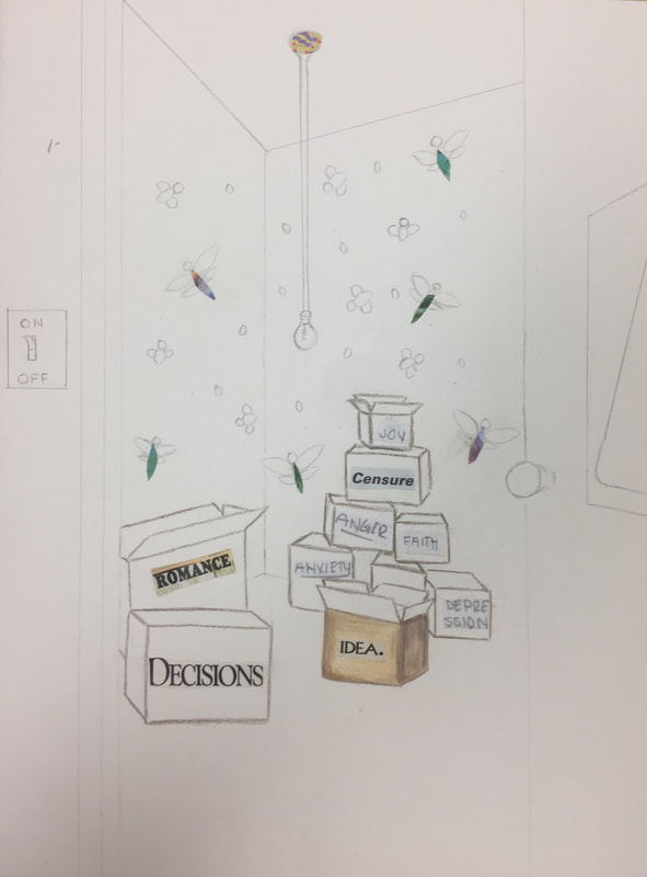
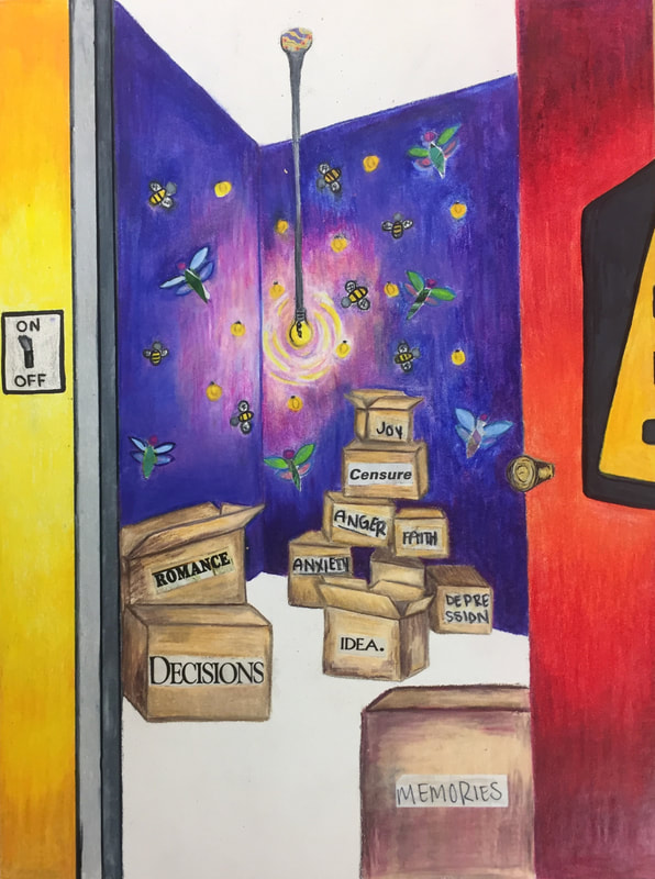
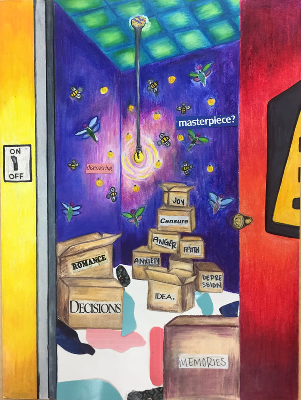
Interior Spaces-in progress
|
|
|
|
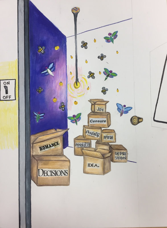
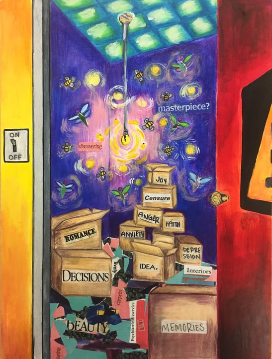
Interior Spaces Final- "psycho-delic"
|
This project is one of my favorites!!! I haven't done a true mixed media with a strong subject matter, and I really like how I executed this one. I think one of the reasons why I put so much of my heart into it, is because it has a lot of personal meaning. I loved the idea of translating my thoughts and inside my head, into the inside of the storage closet. Originally I was gonna make the closet like a dark place, but as I kept working I realized that as sad of a place my head can be sometimes, I wanted to make a piece that made me happy, and show how vibrant I can be when the "switch is turned on". I really liked how intentional all of the colors were as well. The yellow exterior meant to show how I can look happy on the outside, and sometimes it's a whole different reality on the inside. The purple contrasts with the yellow, yet flows with the red of the door and blue/ green in the ceiling. I like how clever I got to be with this project as well. I snuck in a few magazine cut outs in the floor that have a carpet texture, and even the word "carpet" in the floor. I also put in the light switch to represent bipolar depression- how my emotions can switch on and off like a switch. I even threw a caution sign on the door, just to keep it from being plain, and kind of like a warning to others for how complicated and dangerous it is to understand and really get in my head. Overall, my use of prisma, acrylic, pen, and cut outs make this piece really stand out. The bugs, colors, textures, words, etc were all very intentional and made me think about the deeper meaning when working. I haven't done a ton of conceptual art, and this one seems like a mix of conceptual and real life. I hope to do more pieces like this in the future.
|
Pet Portrait Final- "Lil Angel"
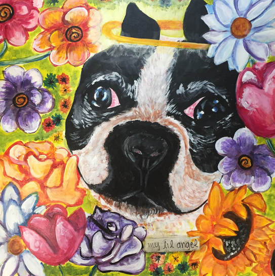
I love this piece so much. It was cool to learn the new technique of acrylic wash, and it worked out really well for this particular project. The layers add a set undertone for each part of the painting, and the paint really allowed me to express my personal style. What i could have done better, would have been to take a little more time on getting the hairs thinner and having more detail in the flowers. However, I really like the abstract aspect, and the addition of the lettering and the halo. Even though Honey isn't dead yet (lol), I always call her my little angel, and so this piece has a lot of meaning to me since she is getting much older. I hope to do more pieces like this in the future. To recap, acrylic/ wash was fun to learn. The subject and composition are interesting, and if I were to change anything, it would be to just spend some extra TLC on the flowers and small details in the face but I find it unnecessary. Learning new things is always a challenge, and painting isn't something I am very comfortable with, so I like how i was pushed.
*side note: I lost my in-progress pics when I got a new phone:(
*side note: I lost my in-progress pics when I got a new phone:(
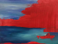
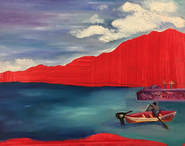
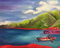
Landscape- In Progress
|
|
|
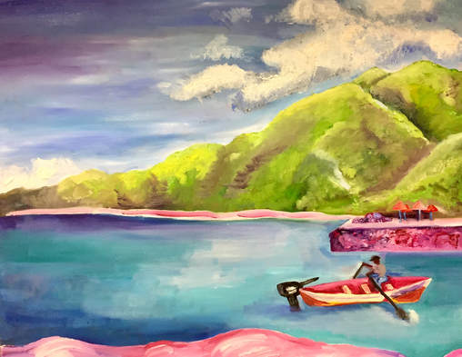
Landscape Final- "A La Plage En Haiti"
|
I have a love hate relationship with this painting. I love the picture I took so much that I feel like nothing will live up to it. However, there are lots of things I like about it. I really like the water, because of the turquoise blues and purple. Also, it doesn't blend too much with the sky. The boat is also really cool, because of the contrast with the mountains with the bright pink/red colors. The mountains are dimensional as well, and not pointy :). I think by far my favorite aspect of this piece is the sand. The sand obviously was not originally pink, but it makes the piece more of my style and whimsical. It was different than other peoples, which I always aspire to do. The composition is pretty much the exact same as the reference photo, with a few changes made. The mountains and texture cause movements that make this piece very interesting. One thing I may have changed would be to have some more balance within the composition, because everything seems to be on one side. Overall, I think this piece is good. Its not my best, but that may stem from the fact that I absolutely hate landscapes, so I dreaded every day that I worked on it. The meaning behind the piece though, is what makes it special.
|
|
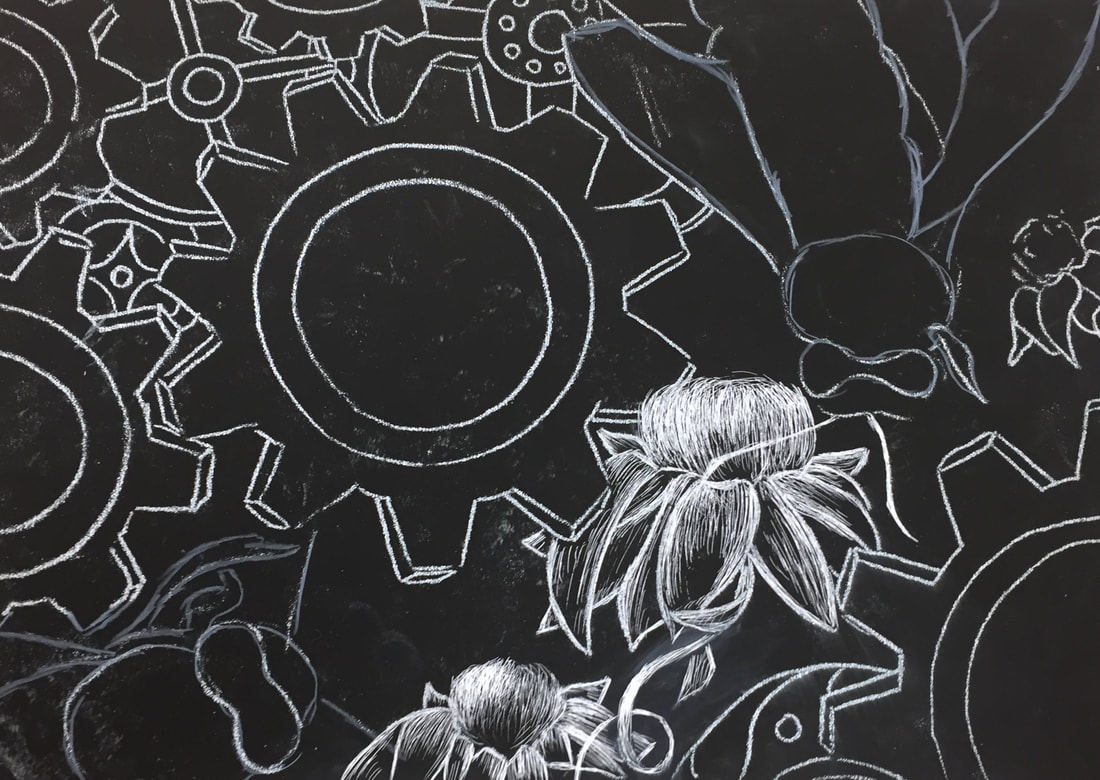
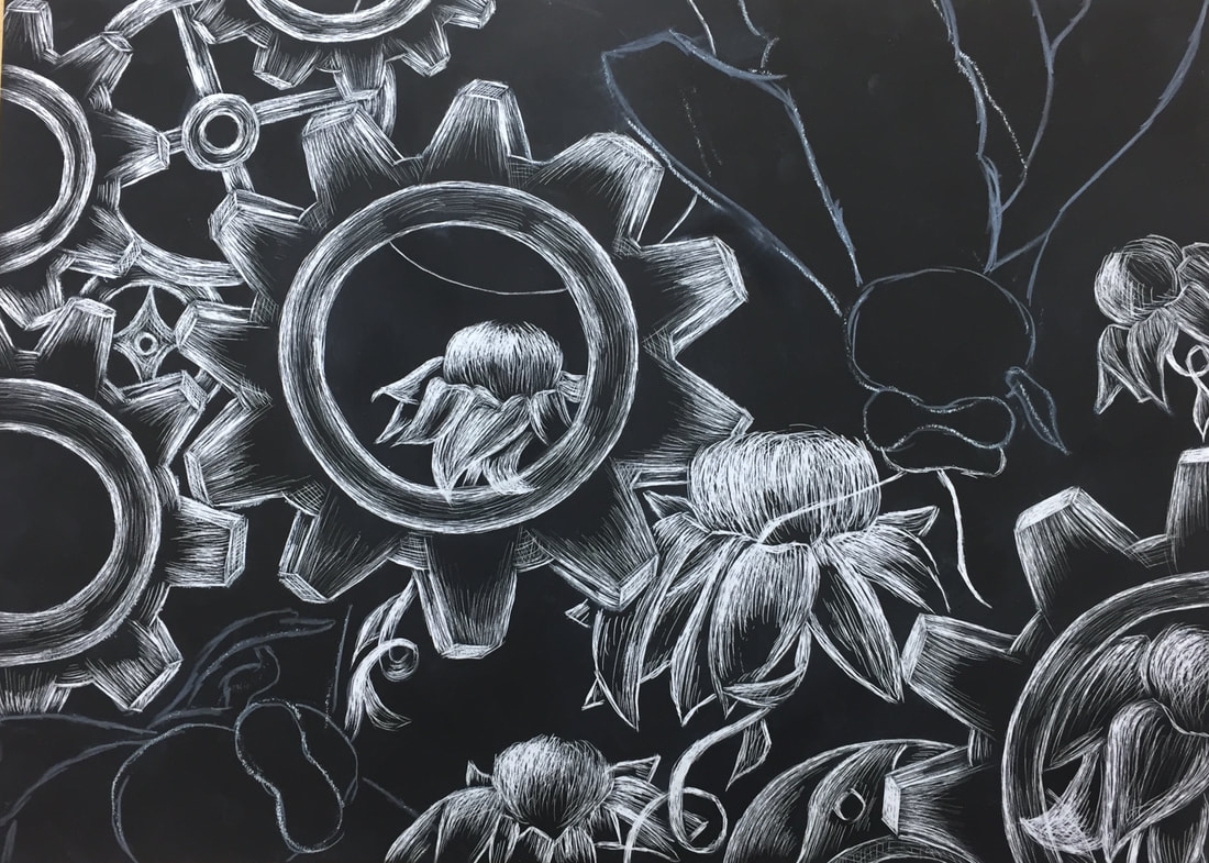
Nature Turns Mechanical- in Progress
|
|
|
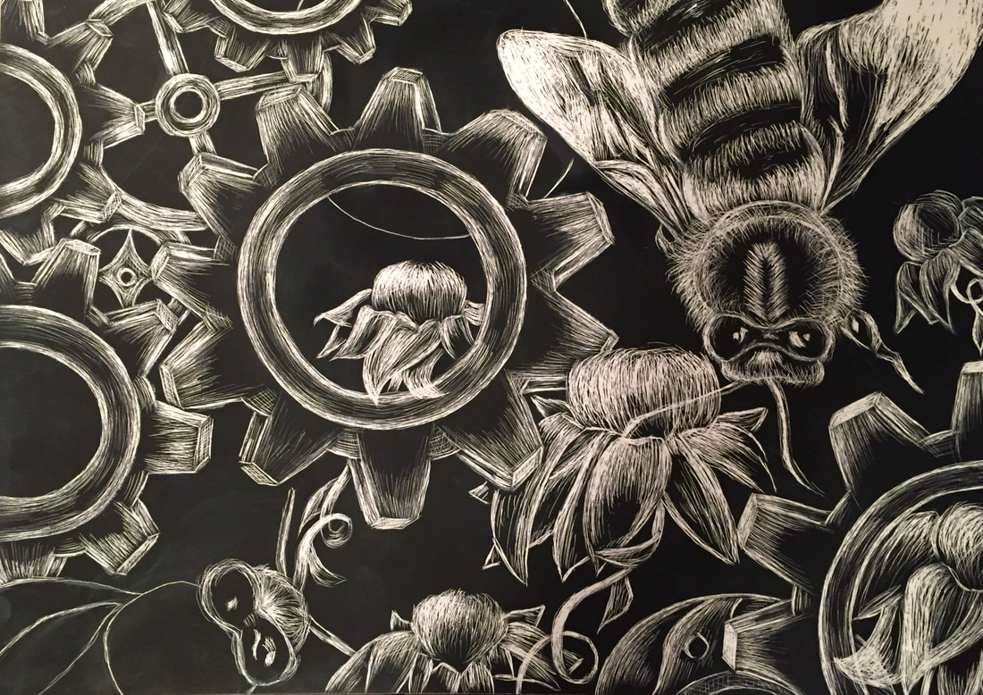
Nature turns Mechanical Final- "Save the Bees"
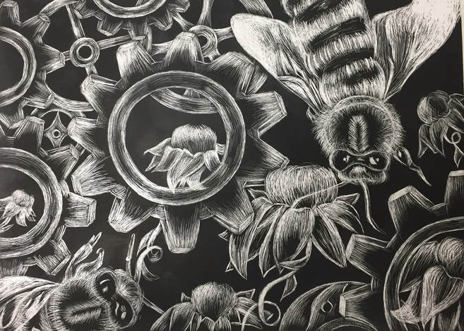
I think this drawing is so stinkin cool!!! I felt I had a very original idea, and I was so excited to be doing a scratchboard again. The composition is one of the best parts about this piece, and I am very proud of it because it was all original, but came from my imagination. Also, I think it is very well balanced. I was worried there would be too much negative space, so adding more than just 3 flowers as originally intended was a smart move. I really like how they peek through the gears and everything, it shows the struggle between the nature and mechanical aspects as encouraged by the prompt. The highlights look great in the bees, gears, and flowers. The texture is one of the most successful things about this drawing. The bees look fuzzy and soft, and the gears look smooth and shiny. Overall, I think this is one of the best I have done all semester. This piece has shown my growth as an artist, in my style, and mastery of multiple media.
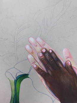
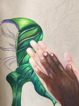
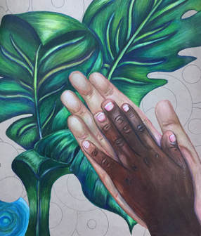
Concentration #1: " Stacy"
|
|
|
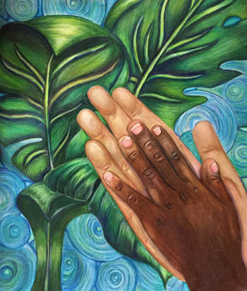
"Stacy" was one of the first children I met upon my arrival to Haiti for the first time, and she is someone very near and dear to my heart (not just because our names rhyme). Although a language barrier did exist, We were able to share love and joy that nothing could stop. She is beautiful, and I miss her dearly. This was a photo I took, originally with mountains in the background. I decided to change up the background to be a sky blue, but the turquoise has really good contrast so I went with mostly turquoise tones with some light cloud blue and green. I think this piece really speaks to my style, because I battle a lot of the time with whimsical vs. elements of realism. I am overall happy with how this turned out! The composition is nice, and I think the detail work is pretty visible. It reads very well from far away too, but i mean its not super ugly up close either. I like that i added more value and brown tones to my hand to make it more dimensional, I think that was a successful addition because I didn't really think about it at first. My favorite part of this piece, though, is by far the banana leaves. They were a pain in the b00ty because they took up so much space and I felt like my life was being taken over by the color green. But i suffered through and it turned out to be really awesome!!
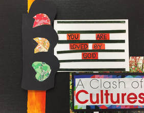
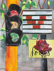
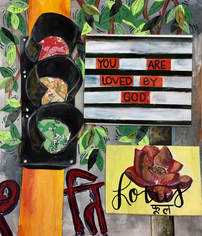
Concentration #2: "You are loved"
|
|
|
|
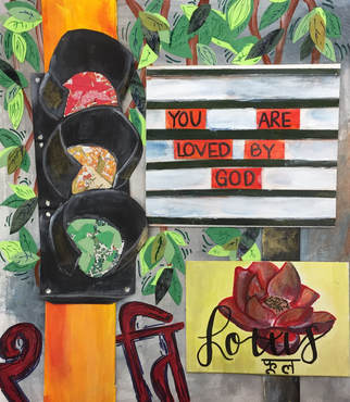
This piece...man was it a roller coaster ride. I do a very bad thing when I do mixed media and i do not plan out much of anything at all and just go with it and I think that was my downfall here. As you can see, I started out on a thick black piece of mat board thinking all was well. ALL WAS NOT WELL. I pretty much had the composition in my head, so that was the easy part. The hard part was figuring out what the heck to do for the background and billboard. At first i just did the first thing that popped in my head and didn't think about it much, I needed to put myself back into Mumbai where the photo reference was taken. And in that city there was a ton of concrete, graffiti, and random plants everywhere. Also, I chose to do a lotus because there are so many references to them throughout India in all places, and it is the national flower (so i just made that board up). As for the graffiti, Some of it is hiding behind the stoplight but basically it means "peace" in hindi. I chose that word for obvious reasons, I just think we all need a little more peace between cultures and belief systems. Overall I think this piece was cool and i totally learned a lot from this experience!!
Final Reflection
This semester was full of challenge, laughter, growth, and learning experiences. Not only did I learn more about who I am as an artist, but also who I am as a person. As a freshman in high school, I took Art I because I enjoyed art in middle school, and I heard it was an easy A. Little did i know, that decision would affect the course of my life for the next four years, and beyond. Ms. Sudkamp was a sweet teacher in our small trailer (without a sink), who encouraged our entire class to do our best, express ourselves, and to learn more about different types of media and techniques. After that semester, I couldn't help but sign up for Art II, sculpture, drawing, Art III, and now Art IV. Throughout high school I couldn't help but wonder what I would do if i didn't have art for a whole semester! Years of experience, practice, and dedication, has now put me in the position I am today. Although there have been many times I doubt my abilities as an artist, I know deep down my teachers have prepared me for my future career endeavors.
Art IV is a class I will always remember. The mistakes I have learned from, the art I have created, and especially the relationships with people i have made. It brings me so much happiness to see this group of students, seemingly so random, come together over common ground, and support each other's art, and emotionally. This class makes me want to go to school everyday. No matter how bad I'm feeling, if i have to skip that class i genuinely feel sad and miss them. I have learned a lot about humility- that I am not the best at everything and that's okay. If someone has a piece that I feel is better than mine, that's okay because I am proud of them and others deserve to be celebrated. Not only this, but i was surrounded by a group of people who are encouraging and truly care about me as a person and an artist, and that is something I will miss most about high school.
This last semester has given me the opportunity to find my voice in my work, and figure out what my style is, what I like and don't like, and what I can do better. I definitely know I can be a better painter, and it' s something I need to work on and put a ton of effort into so I can have a well rounded portfolio to submit. At the beginning of the semester I set a goal for myself to pick a concentration that I love, and I have certainly achieved that! I am constantly so excited for the next pieces to complete and (a little) to wake up at 6:00am to do some art!!!
Ms. Rossi, you have taken me, along with my fellow students as your personal projects who you have worked so hard to see improve over the years, and especially over the last 18 weeks. Your hard work and dedication has shaped me as a person, and I am so lucky I have someone to look up to. You have been my teacher for 3 classes, almost 4, and I think you know me better than almost anyone else at this school. I cannot thank you enough for all of the love, guidance, and encouragement!
