Trite Symbolism
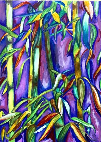
The trite symbol I chose for this project was trees. Trees are overused and trite, because many times they have the stereotypical green fluffy "leaves" and the brown trunk with the hole in the middle. This piece is a creative take on a trite symbol, because the bamboo symbolizes nature and peace, just like trees do. The color scheme, composition, subject matter, and contrast are what makes this piece not trite.
My use of color, contrast, composition, and multimedia makes this piece unique. The bright colors and the wide range of colors are successful in this project. The cool colors with pops of warm color make the leaves stand out from the bamboo and the background. The dark blue and ultramarine as she shadows behind the bamboo shows depth in the piece and makes certain parts of the composition stand out. Another compositional component that makes this project successful, is how the lines of the leaves and the diagonal grouping of them make your eyes move around the piece in a flattering way.
My use of color, contrast, composition, and multimedia makes this piece unique. The bright colors and the wide range of colors are successful in this project. The cool colors with pops of warm color make the leaves stand out from the bamboo and the background. The dark blue and ultramarine as she shadows behind the bamboo shows depth in the piece and makes certain parts of the composition stand out. Another compositional component that makes this project successful, is how the lines of the leaves and the diagonal grouping of them make your eyes move around the piece in a flattering way.
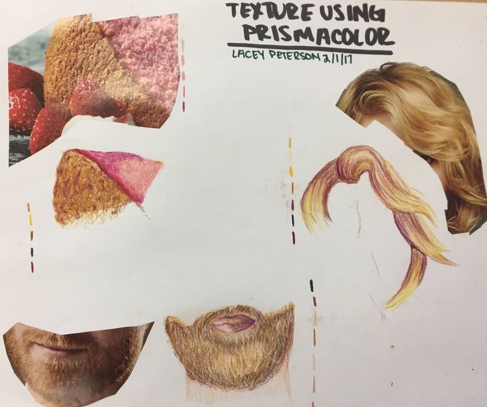
Texture using Prismacolor
|
In this assignment, I used formal elements such as scumbling and hatching. I also was able to incorporate "unseen" colors to the individual examples to make each one more interesting. In addition, I grouped the hair on the head and face, into sections, therefore making it easier to focus on certain shapes, colors, shade, tint, and textures.
I overcame by hatred for drawing hair during this lesson! I still hate it, but I decided to challenge myself and practice the necessary techniques of learning how to draw hair with prismacolor. They are not my best drawings, but they are an improvement from before. |
|
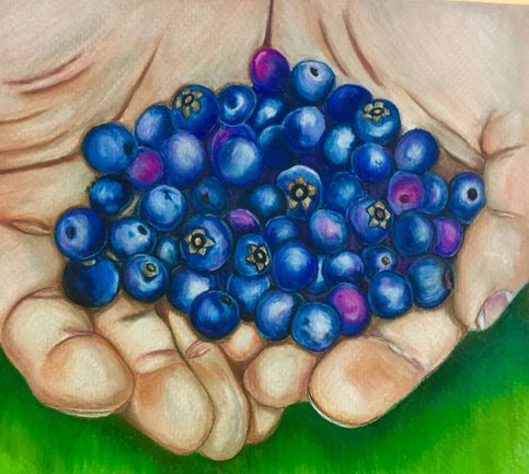
Prismacolor Final
|
In this final assignment, I used mostly blending techniques to achieve the texture in my piece. I used a blending stump to mix the colors together in a unique way for each blueberry, which made this piece very nice and the blueberries look smooth. In the texture of the hands, I used shadows and tints on the folds of the skin and fingers to show the 3 dimensional aspect.
I challenged myself greatly in this project. I've never done hands using prisma, and I also disliked drawing spheres with colored pencil, but I quickly was able to adapt and improve my skills in many ways. I really liked using the blending stump, and I learned how helpful it can be when trying to create a successful blend. I really like the waxy texture I was able to create on the paper, because it makes this piece almost look painted. |
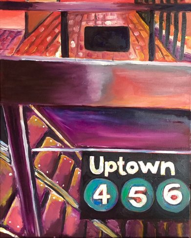
Oil Painting
|
During this unit, I learned how to paint with oils. I quickly found out about how well it blends together, so in turn, I had to do a lot of paint mixing. I also practiced layering the dried oil paint to create texture and depth. In addition, I applied many of the formal art aspects such as the color theory, lines, movement, texture, value, and more.
I used a photo reference that I took when traveling in New York, to create the composition of this piece. I changed up the colors a lot, to create a whimsical look, and a much brighter and more interesting subject, rather than just grey, black, green, and other muted tones. The color scheme is my favorite aspect of my piece, because it makes it very unique. |
|
Figure Drawing
|
|
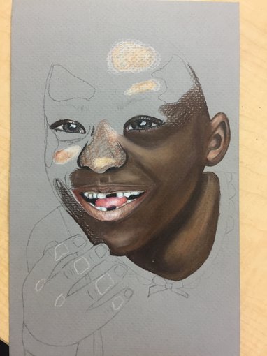
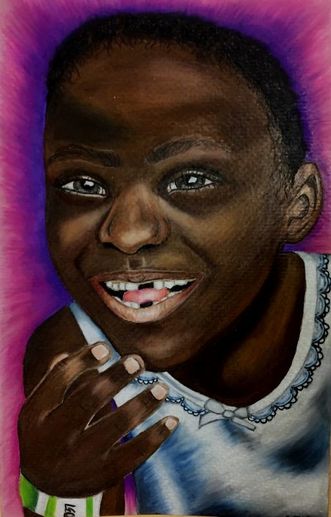
During this project, I was able to practice blending techniques, including using a blending stump, and including colors and tones in the skin and dress that may not be obvious at first, but are underlying yet necessary. I also was able to practice drawing hair, which in the past I have not always loved so much. This unit also helped me develop a better understanding of proportions, and how important they are to have a piece that looks right.
During the planning phase, I used color blocking to determine where the highlights were on the photo, and where they should go on the drawing. I also practiced drawing eyes, a nose, and mouth to prepare myself for this project, making it well executed. Studying my reference picture that I took myself was also an essential part of planning. The blue tones in the dress that were present in the photo, was amplified in this piece to make it more interesting, although in real life the dress was just completely white. Also, I chose this gradient background to emphasize the joy radiating off of her, and to contrast with the dress, band, and her skin. I enjoyed this project, because of how personal the subject is, as well as the use of prismas.
During the planning phase, I used color blocking to determine where the highlights were on the photo, and where they should go on the drawing. I also practiced drawing eyes, a nose, and mouth to prepare myself for this project, making it well executed. Studying my reference picture that I took myself was also an essential part of planning. The blue tones in the dress that were present in the photo, was amplified in this piece to make it more interesting, although in real life the dress was just completely white. Also, I chose this gradient background to emphasize the joy radiating off of her, and to contrast with the dress, band, and her skin. I enjoyed this project, because of how personal the subject is, as well as the use of prismas.
Final Exam
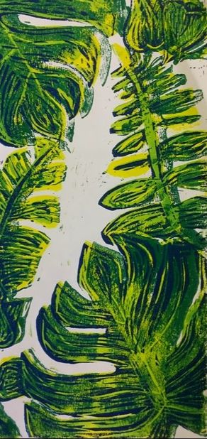
"Tropical Plants" is a linoleum print I created over the course of about a week. I chose to use multiple colors to make it a bit more interesting and stand out with contrast. I chose to do this piece because I love the subject of nature, but I wanted to challenge myself by using a medium that I am not very comfortable with, and am not a big fan of. I am overall happy with the way it turned out, and I like the little imperfections that the print making process brings.
***not pictured, "mushrooms" drawn with oil pastels- stolen before I could take a photo:-(***
I'm sad this piece went missing the next day after it was finished!! However, I did learn a lot about using oil pastels. For one, I still hate them. Secondly, I love the way it looks when done successfully. Overall, I think this project went okay. I should have used a thinner tooth piece of paper, but the texture of the paper kind of added a bit of texture to the entire drawing itself. I liked how I did the background, blue with a contrast to the orange caps on the mushrooms. I may try oil pastels again, but I really dislike how messy they are along with the lack of control and how hard it is to get detail in.
|
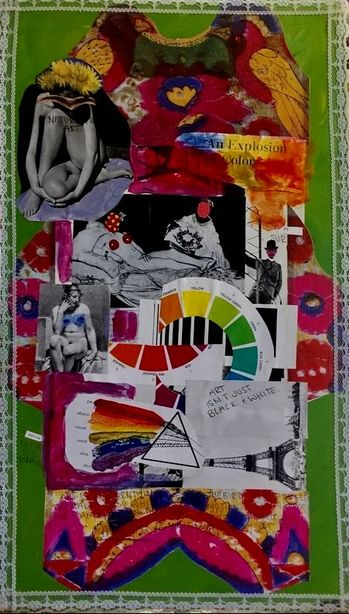
"Art is Not Just Black and White" was made using random material and magazine cut outs found over the course of a few days. I chose to use a piece of wood as my base, to have a strong structure, and not warp with the use of gel medium. I like the green background color, because of the contrast with the use of pink and red in this multimedia. I enjoyed this project, because I was able to express myself by just finding cut outs that were interesting, or that I was drawn to. I didn't necessarily go into this project knowing what my subject would be, but I came up with it along the way. The most inspirational thing I got from this project, was reflecting on the philosophy that art is all around us, in every aspect of life and can be applied everywhere by anyone.
|
Most Proud
|
Most Challenging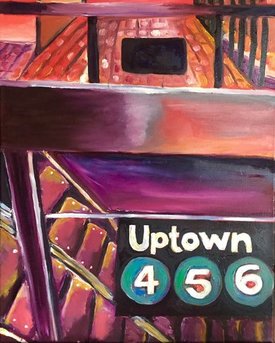
|
Most Proud: "Blueberries"- I'm most proud of this piece, because I have never really been good at drawing hands, and these look great, there's good dimension in the hands and berries, there are shadows in the right places, there is a clear highlight point in all of the berries, and much more. The combination of realism and exaggerated color schemes is a big part of this piece, as well as my style in general. One thing I really like about this piece, is that the drawing is 1000x more interesting than the actual photo!
Most Challenging: "Psychedelic Subway" - This was the most difficult of my pieces, because I have never worked with oil paint before. I was going for more of an abstract look, but I'm not sure if it was executed quite like I wanted it to. I wanted to completely change the colors that were in the reference photo, to make it interesting and cool. However, painting with oils is messy and hard to control if you don't practice! I believe that I can improve on my oil painting in time, and find my painting style in the process, because right now I lack a specific style since I am more comfortable with drawing.
Most Challenging: "Psychedelic Subway" - This was the most difficult of my pieces, because I have never worked with oil paint before. I was going for more of an abstract look, but I'm not sure if it was executed quite like I wanted it to. I wanted to completely change the colors that were in the reference photo, to make it interesting and cool. However, painting with oils is messy and hard to control if you don't practice! I believe that I can improve on my oil painting in time, and find my painting style in the process, because right now I lack a specific style since I am more comfortable with drawing.
What I liked about Art 3
|
Making Art 3 better
|
