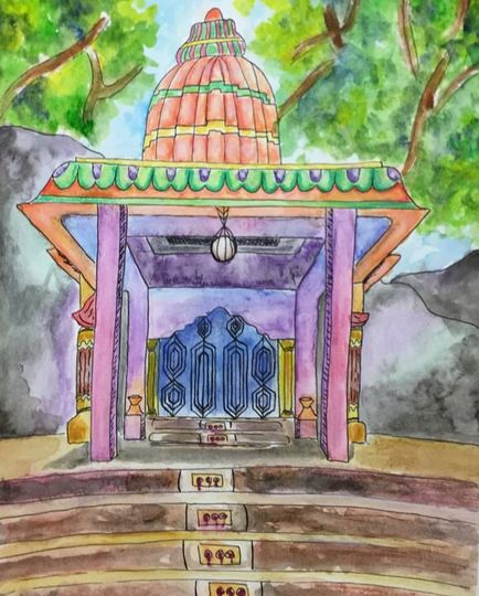
Concentration #3 "Waterfall Temple"
|
|
|
|
|
This piece is one of my favorites from this semester! I love how the colors flow together nicely, and the texture I was able to create from the watercolor was great. I really enjoyed using watercolor pencils as well, I could get good details in there and values as well. Another aspect of this piece I like is the interesting architecture, and I think I executed the perspective well. One thing I wish I could have changed was the composition. I like the composition, but I think it could have been a lot stronger. The only issue is that I only had this photo from my trip and it would have been difficult to try and imagine it differently. Despite a somewhat weak composition in my opinion, I really really like this piece. I took a risk because at this point I wasn't very comfortable using watercolor, but now I feel like I have somewhat of a mastery with this media. I am really impressed with the detail, value, color scheme, and texture all being well executed, so I feel like it is a solid representation of my style and concentration as a whole.
|
|
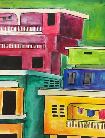
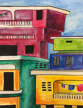
Concentration #4 "Petionville Penthouses"
|
I think this piece is pretty cool. Its not my fav but I also don't hate it. The perspective might be a little off for some parts, but I think the colors, composition, and idea itself make up for it. As you can see, I originally had a green background and it looked really weird. I can't remember who gave me the advice, but I ended up painting over it and giving it a light sky blue background, and it looks sooooo much better!! It really takes me back to haiti considering these apartment buildings are everywhere. Although in reality they're kinda dirty and filled with people living in unsanitary/ impoverished conditions, I choose to remember how the beauty of the people and culture reflect into their environment. On the surface, Haitian homes are kind of sad and depressing despite their bright paint, but deep down their people and my memories are full of vibrancy and beauty, and I wanted that to sort of translate into my concentration.
|
|
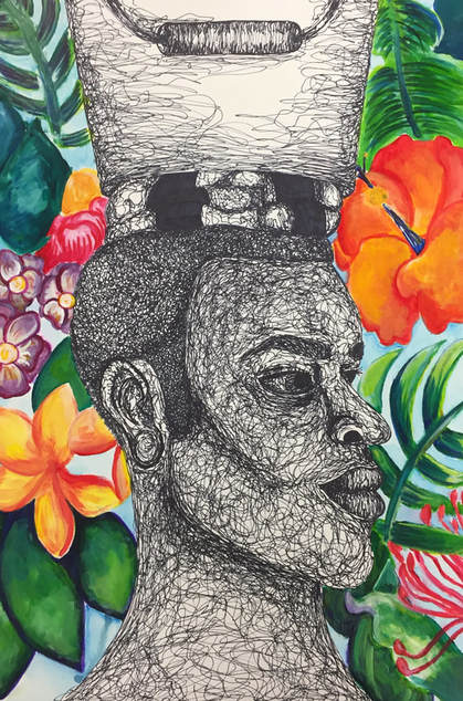
Concentration #5 "Caribbean King"
|
This piece is sooo cool!!!! This one is another one of my favs. The original pic that inspired it was blurry, so I took a photo of one of my friends and used his facial structure for the portrait. I really like the contrast of the black and white face and the colorful background. Again, I wanted to take a concept that might be deemed "third world", and show the beauty/ vibrance found deeper. I used acrylic paint, watercolor, and marker to get the finished look of the background, and overall I think its really freaking cool. I might go back and add gel pen (I literally just thought about that as I was typing this) but I really think this is just a dope piece. The texture, values, and interest created by the use of the pen is my favorite part. It went by so fast, I think I finished the entire head in like 2 class periods. I think the composition is pretty alright, maybe could have been stronger but again I think the positives outweigh the negatives. I named this piece "Carribean King" because even though he might not be wearing a conventional crown, he looks confident and strong.
|
Concentration #6 "Stacy"
|
|
|
|
|
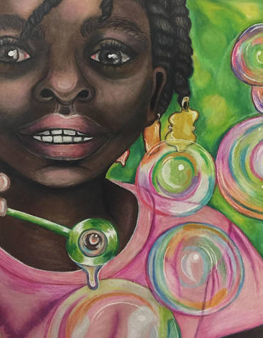
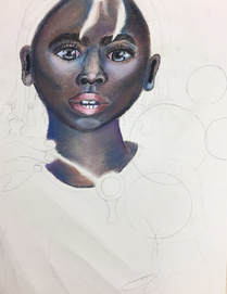
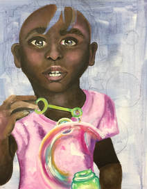
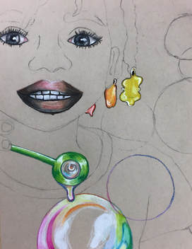
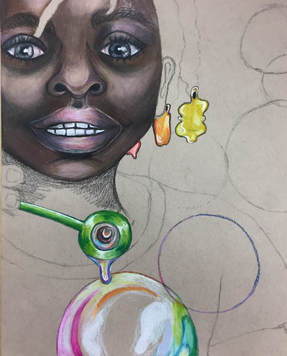
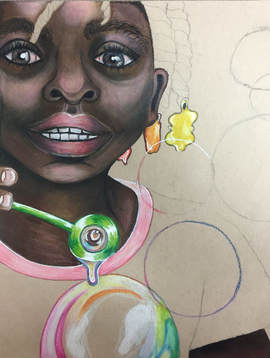
This piece is literally gonna kill me. I attempted a painting, a chalk drawing, and now I'm saying screw it and doing a prismacolor portrait. The oil painting was driving me nuts because of the blending, and I felt like I just kept messing it up the more I added paint. I eventually got to the point where I thought I'd be better off drawing it, and thought "oh I haven't used chalk yet this year maybe I should try it out!" WRONG. WORST IDEA EVER. The chalk was so blendy and eventually just became so dull looking and overblended and it was at the point of no return and now I want to burn it. I'm just gonna bust out a quick prisma drawing of it and hope for the best. I have more control with colored pencil, and there's good pigmentation and I think it will tie together so much better. I'm also a lot more comfortable with prisma and I can do it relatively quickly. I rarely do a drawing in colored pencil I'm not happy with so i think this will be a LOT better. Back to the concept. The composition is really cool, because I added a ton of bubbles to fill more of the negative space and just add quirkiness and imagination to a somewhat mediocre photo that I took in Haiti. It speaks well to my concentration again, adding a bit of surrealism to photos/ ideas already implemented in my memories.
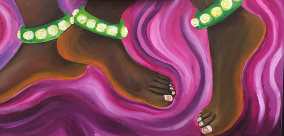
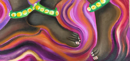
Concentration #7 "Dancing Feet"
|
This is one of the only oil paintings I'm actually kind of happy about. I really really like the background. I find it funny how much I love to use magenta in my pieces but I would never wear/ use it in real life. I think It has really nice contrast with the skin tone in the feet, and just flows together well overall. The wavy look in the paint strokes was intended to imply some kind of movement and I think it looks super cool and abstract. I've noticed I really like doing kind of a mixture of (kinda) realism and abstract in a weird way that (usually) works together. The composition is pretty successful, it could have been better but again I didn't have much time or reference pics so a creative composition was kind of lacking. What I like most about this piece is the vibrancy of colors and movement. One thing I wish I would have done differently was a more interesting composition, maybe from a different angle (foreshortening) or with more feet. However, I still think overall this is a successful painting. As much as I kind of hate oil, this one was pretty cool and had some nice textures. Another thing to note here is that Indian dancers will sometimes dye/ paint their feet with henna, creating an orangish-red tone on the bottoms of their feet and toes, which I incorporated into this painting.
|
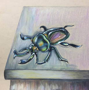
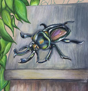
Concentration #8 "Bug's Life"
|
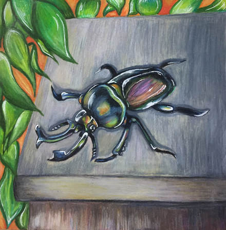
This drawing was super cool to do!!! One of the cringiest bugs I have EVER witnessed in my life was in India. It was terrifying. And they were everywhere! So I wanted to do a piece to pay homage to the disgusting yet beautiful Stag Beetle. It is perched on a the ledge of a short concrete wall right outside the front of our host house. I found some cool pictures that inspired me to be a little more colorful than just a straight up black beetle, so I added a ton of other colors to show the reflective quality. The gel pen also created a nice shiny look to the shell. I really like this piece, but I wish I did something different to the background. I don't know what, but something different. I think the composition is fine, it was hard to come up with without copying from someone directly. I think I was able to get some good details in by using prismacolor/ gel pen, and I was glad to be back using one of my favorite materials. With my style I'm still noticing a cool interpretation of the real world- where things are a little more imaginative colorwise. Overall, this piece is a cool little drawing that has a story behind it that I will always remember.
|
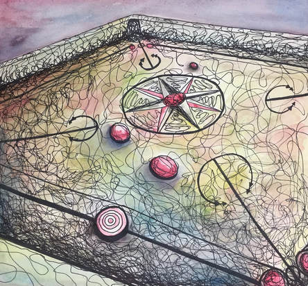
Concentration #9: "Carrom Champs"
|
When I was at the children's home in Odisha, one of the only things the boys did to pass the time was play Carrom, a south asian board game. It was such a wonderful memory to see them get so excited and play. I think my decision to do pen and watercolor was a good move, not only because it was fast, but because it looks cool with the perspective. I really like the composition of this, and how the game pieces look from those angles. I like how I used just red, yellow, and blue to create all of my colors, it was a challenge but also flowed together well. overall, this drawing was really cool to make. It was central to my concentration idea, but it was also executed well! It's not my favorite, maybe I could have done better, but in the time given it was successful.
|
Concentration #10: "Lotus Pond"
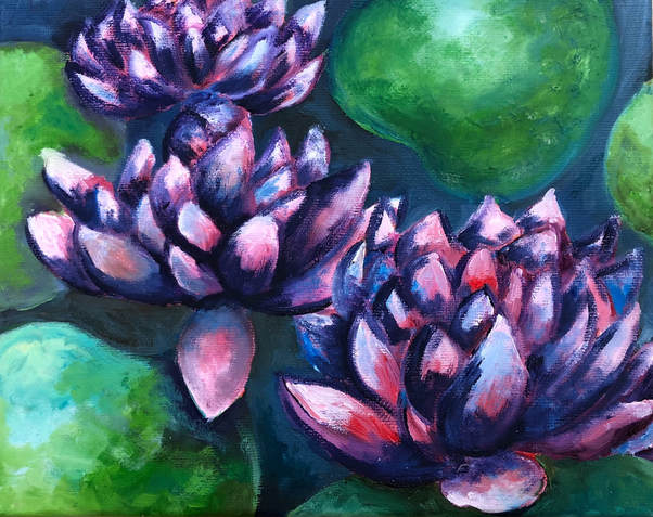
This painting was literally the only oil painting I like. I did this really fast too, in like 2 days, because it was so small and I was runnin out of time!!!! I think it looks pretty good considering how much I rushed it. Again, I think this could have been wayyyy better if I had extra time and a bigger canvas. I like the composition, it really focuses in on the flowers and allowed me to do this faster instead of doing a bunch of little lily pads and lotus flowers. I like how there was little negative space, and the contrast between the pink flowers and the green lily pads; the highlights and the shadows are very strong. I think you're also able to see a distinct style in this painting, because of the flat square tipped brushes and the paint color choices. This piece relates to my concentration, because Lotus flowers is the national flower of India. Although I didn't see any in person, I saw paintings and murals of them everywhereeee. The symbolism is nice too, because it basically represents growth and beauty coming from a dark place (murky water). Overall, this painting isn't my best, again because it was down to the wire, but it was pretty successful.
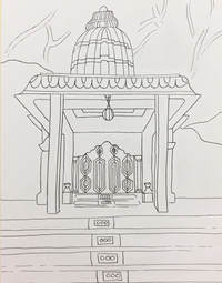
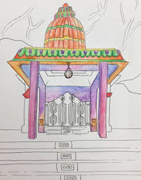
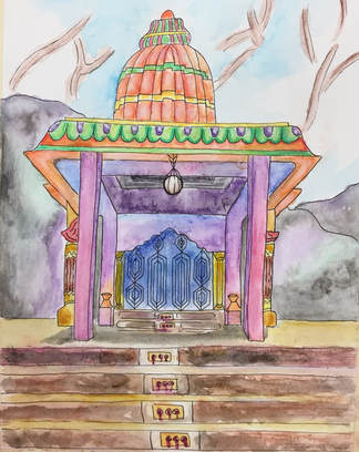
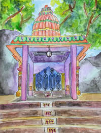
Concentration #11: "Gateway"
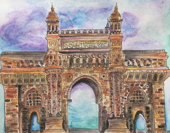
This piece was one of my favorites to do. I honestly never thought I'd even finish it because I started it over break and procrastinated finishing it for weeks, since it took so long to draw out, then I had to redraw over in pen, and then use watercolors and it was soooo tedious. However, all of the struggling was worth it because this is one of my absolute favorite pieces. I really like how I did the sky, I wasn't sure how to make the clouds look good but it kind of just happened. I also really like the blend of the purple and blue sky to create a sunrise effect. I also like all of the value incorporated into the details. It looks clean and well crafted, and I'm very happy with how it turned out. I don't believe I could ever do the real gateway a justice because it's just so beautiful. I hope to do more pieces like this in the future.
*****Concentration #12: "A la Plage en Haiti" originally from Breadth in Art 4 section
Final reflection
AP Art has been an emotional rollercoaster. I think the biggest highlights of this class has been meeting the most amazing people and growing in our friendships, as well as becoming an even greater artist. I completed all of my goals from Art IV, to build friendships, and execute a strong and unique concentration.
I have always had a love and appreciation of art. But up until a couple of months ago, I had no idea that I wanted to use my creativity in my career. I have so many fears about the future. Still, I have so many doubts about my abilities. Still, I make things I am not proud of and just want to throw in the trash. Aside from all of this, I will persist. I don't think my insecurities as an artist will ever go away. Maybe lessen, but never leave, because I'm my worst critic. Sometimes I get lazy and don't even want to think about drawing or painting. However, I will always keep trying to do my best and I can't imagine doing anything else with my future.
I am so fortunate to have had the opportunity to be in this class. I really believe that God has put me here with all of these people for a reason. Each and every one of my classmates have made me who I am. I love how we have been able to encourage each other in our craft. We are all so unique and talented in different ways, and It's beautiful to see it all come together into one class.
